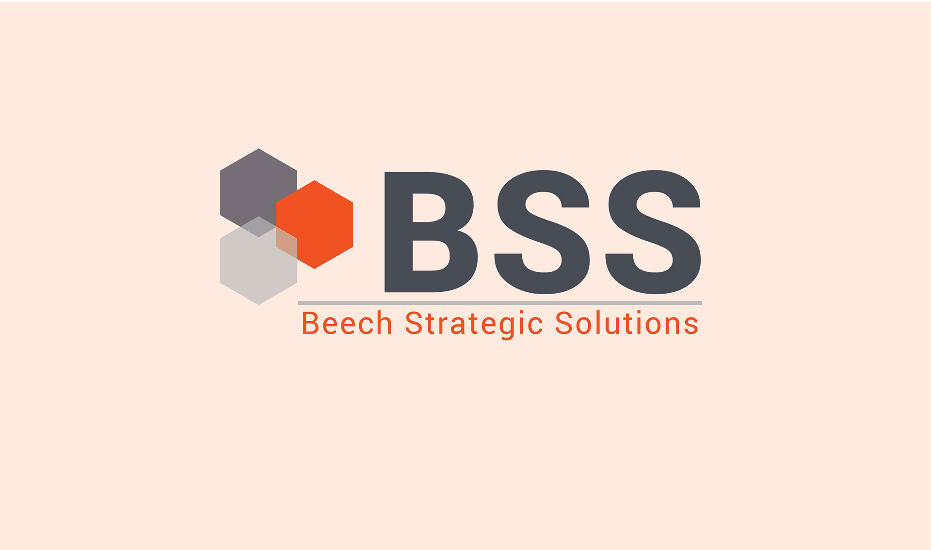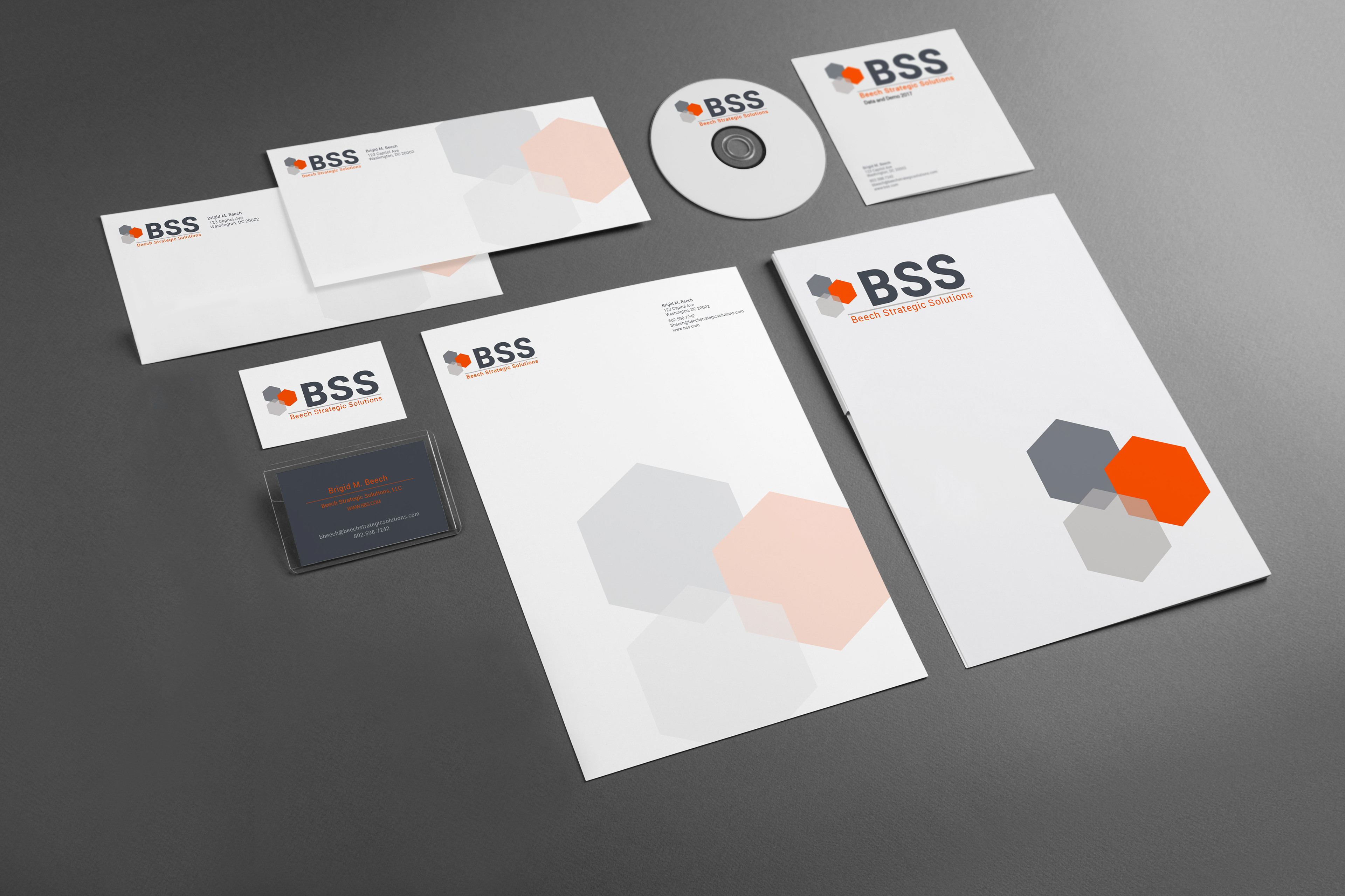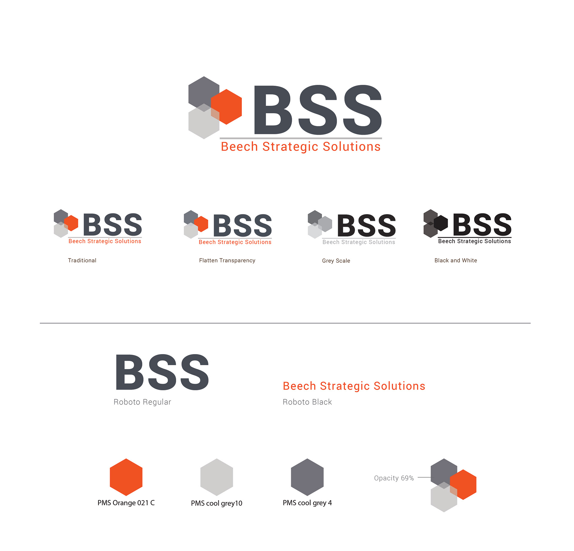
Beech Strategic Solutions
The BSS Logo and Branding Project was for a company that provides IT Management, software integration and client consulting. The Client wanted to communicate "something clear, crisp and simple" despite the lengthy name. The idea was to create an image that used uniform color and feel while still embracing a pop of color. The final design resulted in connecting 3 shapes to communicate the three elements the make up BSS - IT, integration and consulting. The Orange created that color pop to connection point with the element and name.